Visualizing a Nation's Blood Donation and Demand
Posted on:2024-12-21
Category: Data Visualization
Many have reported that the blood donation rate is decreasing. In January 2024, the U.S. Red Cross announced that the current status of blood donation is a emergency blood shortage, explaining that the number of blood donors hit all-time low for the past 20 years.
To confirm whether such a problem exists, I decided to delve into this issue. Initially, I tried to study the blood donation status of the U.S., but due to multiple parties controlling the blood donation system in the U.S., I instead chose another country that had a centralized blood donation system. I ended up choosing South Korea since it well-documented their blood donation system and had a centralized entity controlling the blood donation system.
Data Collection
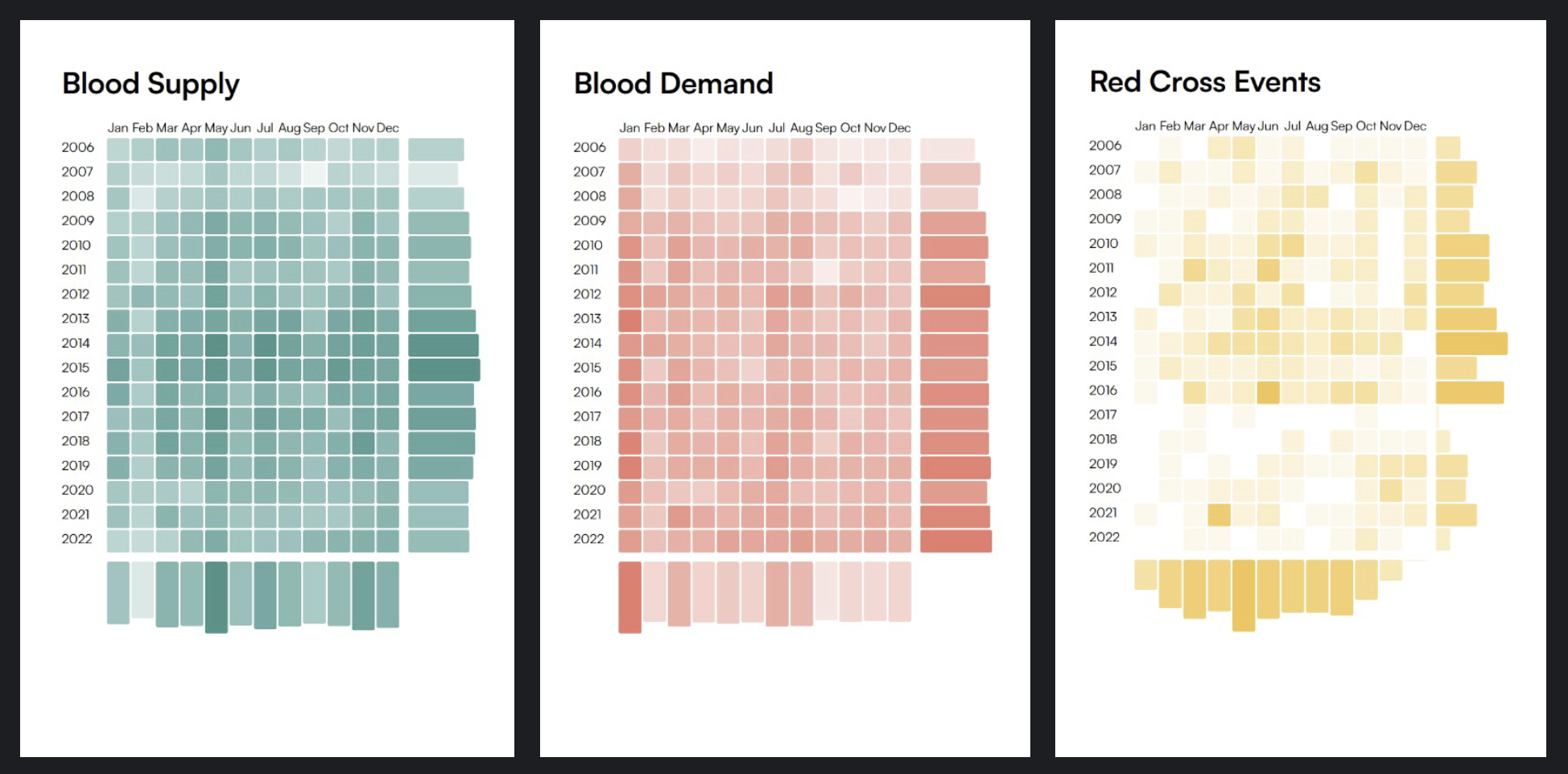
The data was collected from KOSIS(KOrean Statistical Information Service). I did this project with a class mate, and we gathered the number of blood donors, the number of blood donation, and the number of blood donation centers.
While gathering data for blood donation supply was relatively easy, there was no definitive data for how the donated blood was used. We ended up extrapolating the data using a proxy data. We collected the number of patients, the number of surgeries, and the number of blood transfusions from KOSIS. Through calculating the blood used in hospitals each year, we were able to estimate the demand for blood.
In addition to blood donation supply (donors) and demand (hospitals), we also collected events the Korean Red Cross held to promote blood donation in the country. In doing so, we hoped that we could find a correlation between the promotional events and the number of blood donors.
Strategy
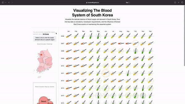
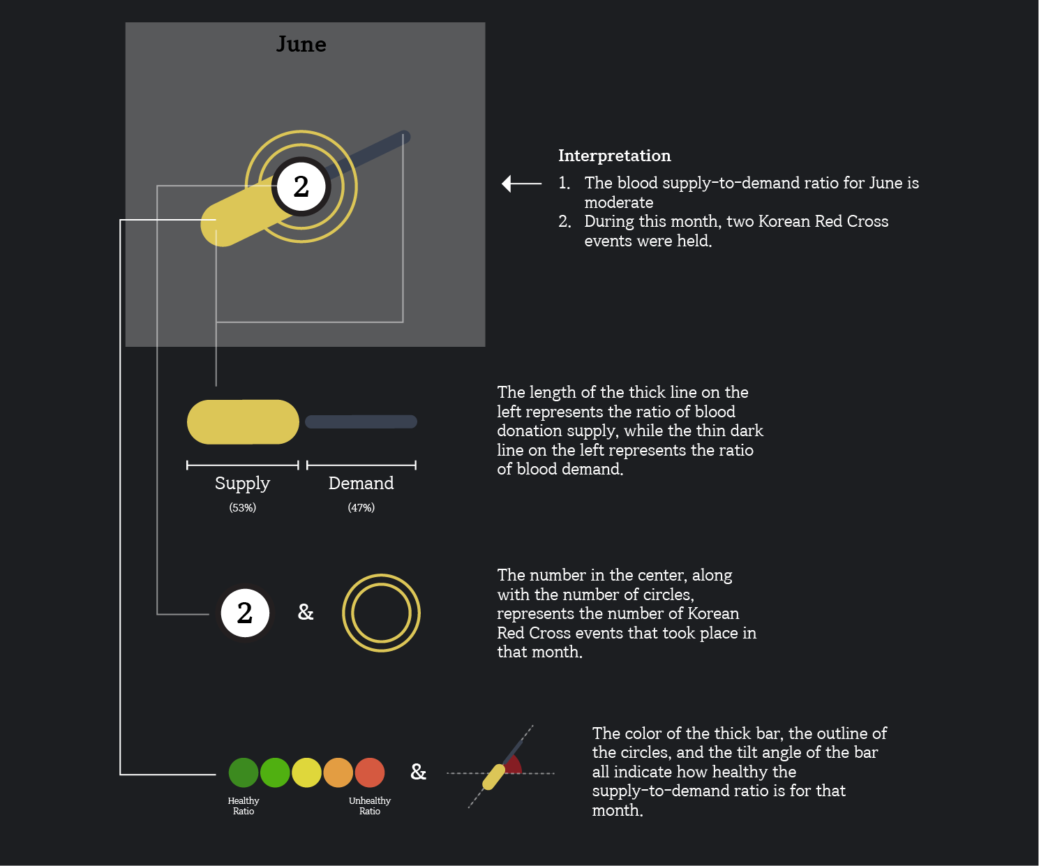
With all our data, we decided to create an effective visual representation of the blood donation supply, blood usage demand, and the promotional events. We found that there is an uneven distribution of blood donation frequencies depending on the month and decided to find a way to effectively visualize the discrepancy. We strategized to focus on the ratio of blood donation and blood usage.
After multiple experimentation, we found that balancer-looking shape was effective to show how imbalanced a blood donation supply and demand are. In our visualized blood donation supply and demand, the left thick line represents the blood donation, and the right colorless thin line represented the blood usage. The thicker the left area, the more blood donation there was compared to the blood usage. We additionally used color and angle to represent how much the ratio is off.
Findings
Through visualizing, we could discover that South Korea especially has a healthy ratio of blood donation and blood usage especially near May, and this seems to be due to the summer season and the frequency of promotional events held by the Red Cross. However, the ratio of blood donation and blood usage is not as healthy in the winter season.
Interestingly, after March 2020, the time when COVID-19 started to spread in Korea, the ratio of blood donation and blood usage has decreased significantly. From this, we can know that the COVID-19 pandemic has had a significant impact on the blood donation system in South Korea.